From the Main Stage to the Regions
One main-stage opera and two regional productions were delivered across Opera Queensland's 2023 season.
Client: Opera Queensland Role: Graphic Design, Motion Design & Production Management Scope: Three productions — one QPAC main-stage opera, one 22-town regional tour, and a regional festival — with the tour and festival in concurrent production
Overview
This collection brings together three productions I led design and production on during Opera Queensland's 2023 season: Macbeth in Concert, the company's flagship main-stage opera at QPAC; Lady Sings the Maroons, a touring show that carried opera to twenty-two regional Queensland towns; and the Festival of Outback Opera in Winton and Longreach.
They tell a story about working at scale and under load. Macbeth shipped first; I began designing the regional tour the moment its program went to print — a direct handoff with no downtime. The tour and the festival were then designed and produced concurrently, the season's genuine parallel-load stretch, with two major productions advancing at once. Across all three, the same visual language held steady — from a single high-stakes opening night in Brisbane to a state-wide rollout and an outback festival ten hours' drive from base.
Macbeth in Concert
Main-stage opera · QPAC · 3 performances · 800 programs printed, 600+ sold (75% sell-through)
Art Direction: Laura Hansford Graphic & Motion Design: Carlos Nobile Hero Photography: Dylan Evans Program Photography: Jade Ferguson Artistic Director: Patrick Nolan
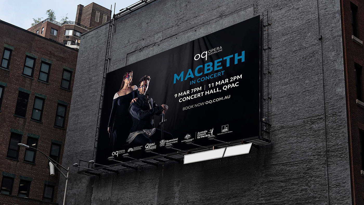
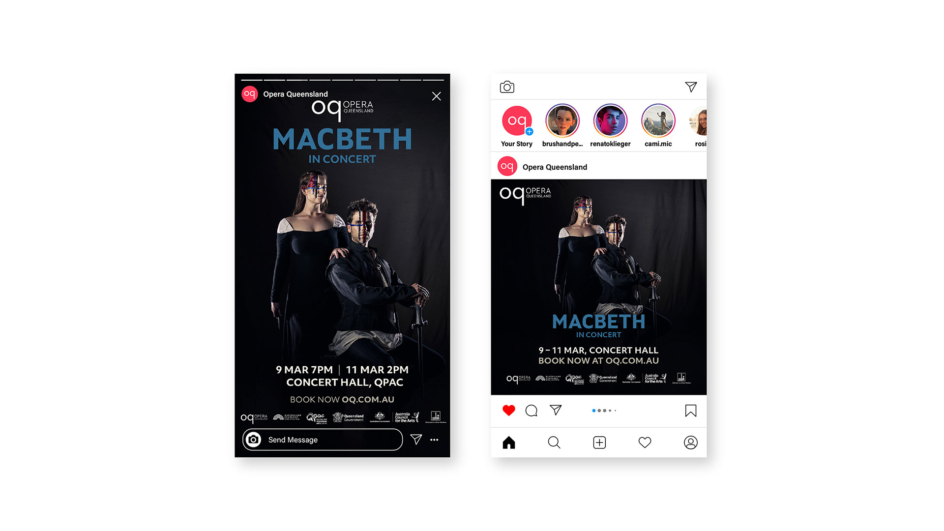
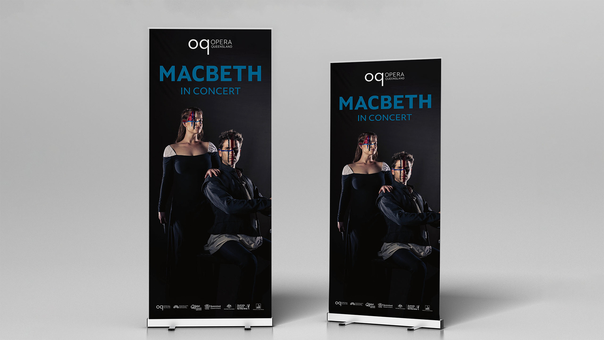
Opera Queensland's first main-stage production at QPAC in 2023 — an adaptation of Verdi's Macbeth, staged in concert. The visual design had to carry the opera's dark, dramatic register across every touchpoint, from large-format venue signage to an intimate printed program.
Context
A main-stage opening night is unforgiving. The program's content had to be commissioned, produced and printed against an extremely tight deadline, with the printer delivering the finished run only hours before the doors opened. There was no room for a second proof.
Role & Execution
• Led the production's visual identity rollout under Laura Hansford's art direction, and produced the motion graphics
• Owned the QPAC signage suite, including posters and electronic display screens
• Commissioned a performing-arts journalist to interview the lead singers, then published the full interviews in the program and an edited version on the Opera Queensland website.
• Directed Jade Ferguson's rehearsal photography, scheduled less than a week before opening, to supply the program's editorial imagery
• Managed the program's content production and print timeline end-to-end, carrying final sign-off with the printer under deadline pressure
Outcome
• 800 programs printed across the three-night season; 600+ sold — a 75% sell-through
• Full signage and screen suite delivered and installed at QPAC.
I• nterview content repurposed across print and web, extending the production's editorial reach
Demonstrates: main-stage campaign delivery, editorial commissioning, and production management under a hard deadline.
Lady Sings the Maroons — The Regional Tour
State-wide touring production · 22 regional Queensland towns
Graphic Design: Carlos Nobile Director & Creator: Laura Hansford
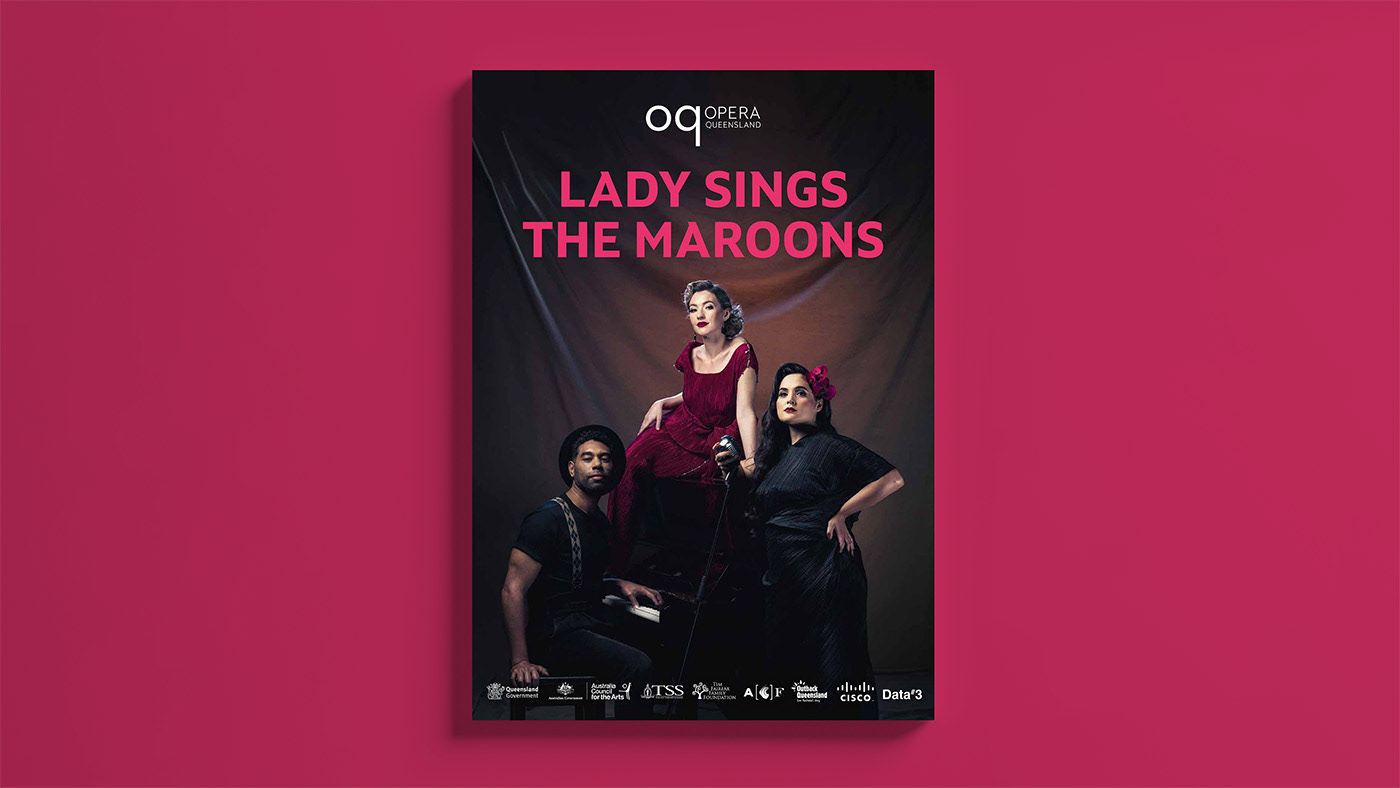
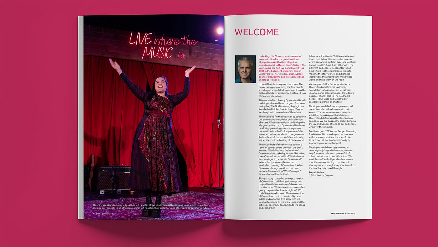
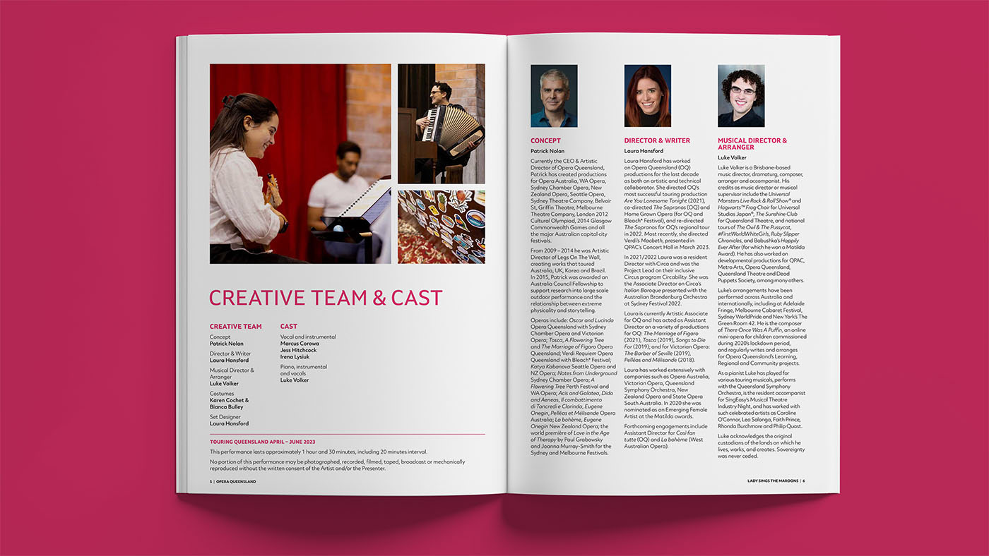
Lady Sings the Maroons is Opera Queensland's touring production, bringing opera to twenty-two regional Queensland towns — audiences who would otherwise travel hours to see a show of this calibre. Described by its director and creator, Laura Hansford, as a love letter to Queensland, it draws on the work of the state's finest artists for a nostalgic show built to travel and to connect.
Context
Design began the moment the Macbeth program went to print — a direct handoff from the main stage to the road, with no downtime in between. A touring show is as much a distribution problem as a design one: the assets had to work across twenty-two venues run by different local councils, each marketing the show to its own community. The system had to be consistent enough to read as a single production and flexible enough for 22 local rollouts. It was also produced in parallel with the Festival of Outback Opera (below) — the most concurrent stretch of the season.
Role & Execution
• Extended the season's established art direction into the tour's hero image and full asset suite: banners, posters and a digital program
• Built a promotional toolkit and templates that let local councils market the show in their own regions — a self-serve system designed for twenty-two separate rollouts
• Directed a video production company across promotional content for the website, press releases and social media
Outcome
• Toured to 22 regional Queensland towns
• Council toolkit adopted across venues, enabling consistent local marketing without central rework for each town.
• Promotional video suite delivered across web, PR and social channels.
Demonstrates: state-wide rollout design, scalable template systems for third-party use, and rapid handoff between concurrent productions.
Festival of Outback Opera
Regional festival · Winton & Longreach · 1 week · 3rd edition (2023)
Graphic Design: Carlos Nobile
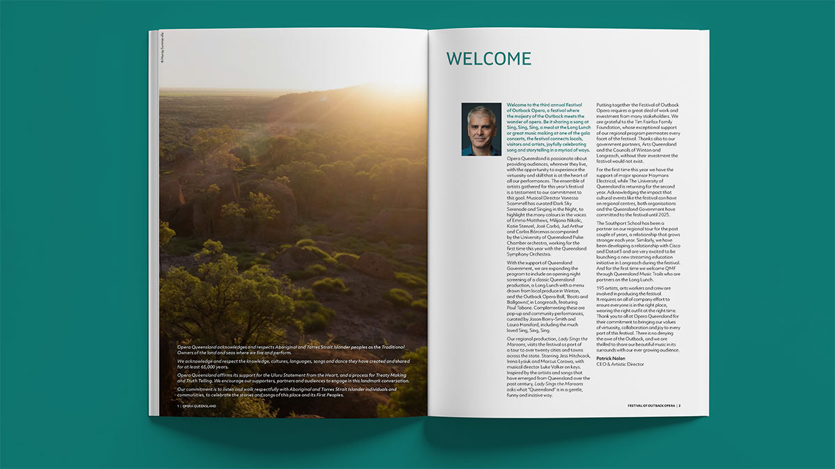
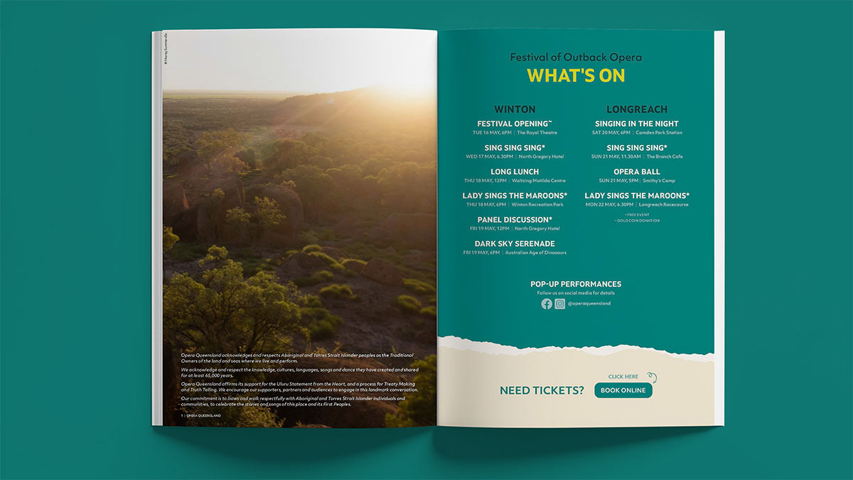
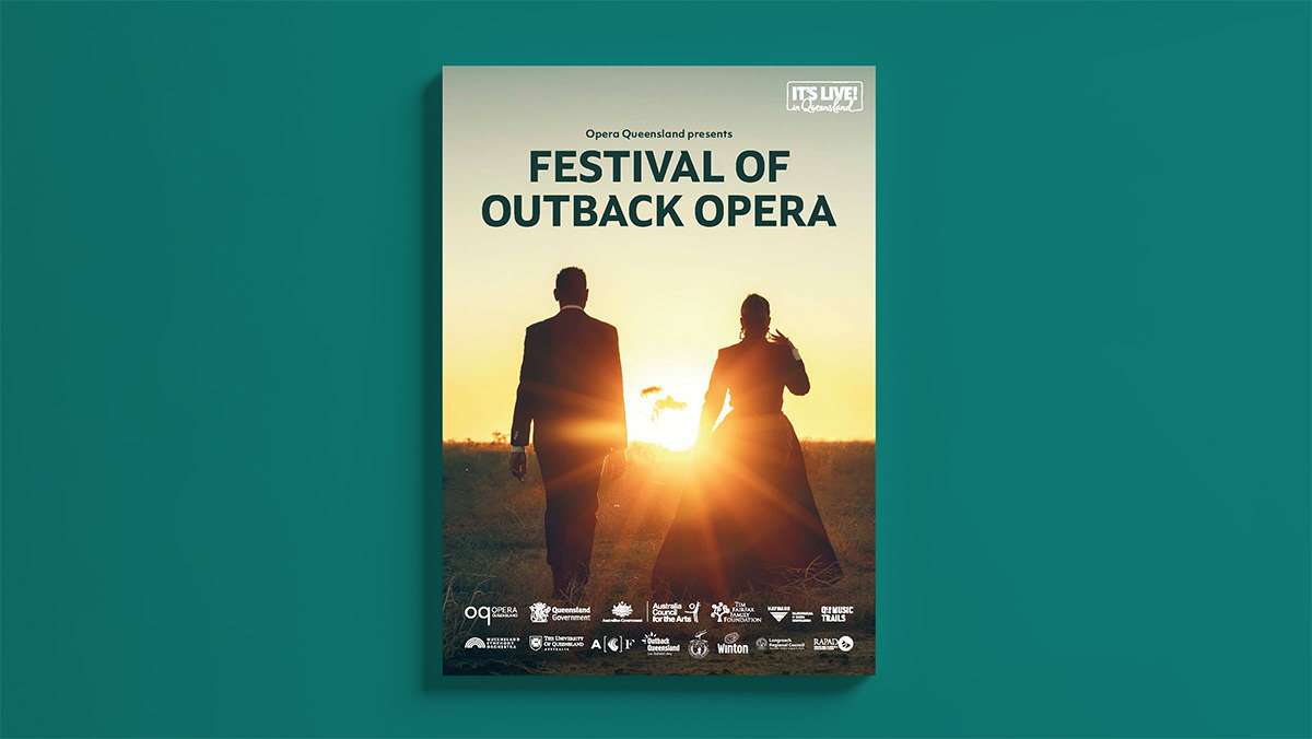
At the heart of the Queensland outback, Opera Queensland performs world-class opera and shifts the cultural landscape of regional communities. The Festival of Outback Opera runs for a week each winter, split between Winton and Longreach — 2023 marked its third year. Its audience is a particular mix: caravan travellers, regional communities, and city opera-lovers making the trip west to escape the rush and hear their favourite singers in a setting they can find nowhere else.
Context
The brief was to make this edition feel distinct from previous years while still reading as part of a continuing series — and to hold to Opera Queensland's broader visual identity throughout. Two complications raised the stakes. The festival's planning and design phase ran concurrently with the Lady Sings the Maroons tour, so I was managing two major productions. And the venues sit roughly ten hours' drive from Opera Queensland's Brisbane base, turning every asset into a logistics problem and putting extra pressure on the schedule.
Role & Execution
• Led the design of the festival's full visual communication suite, balancing a distinct annual chapter against series continuity and the Opera Queensland identity
• Managed two major productions concurrently — the festival alongside the regional tour — through the season's most demanding stretch
• Planned the asset delivery sequence around the event logistics: produced the large-format signage first (most space, easiest content to lock and approve), then the lighter print and digital pieces as content firmed up — small enough to travel in staff luggage or distribute online, supported by the signage already shipped
• Managed and assisted with the on-location video and photography in Longreach, accompanying the professional photographer and videographer
• Liaised directly with the Regional and Learning Director responsible for the festival to align design delivery with the event plan
Outcome
• Reviewed positively in Limelight magazine
• The visual system was built to be reusable as a template for future editions, freeing creative capacity for new content and experiences rather than rebuilding each year.
Demonstrates: concurrent project management, logistics-driven production planning, and the design of reusable identity systems.